How hypothyroid can it be

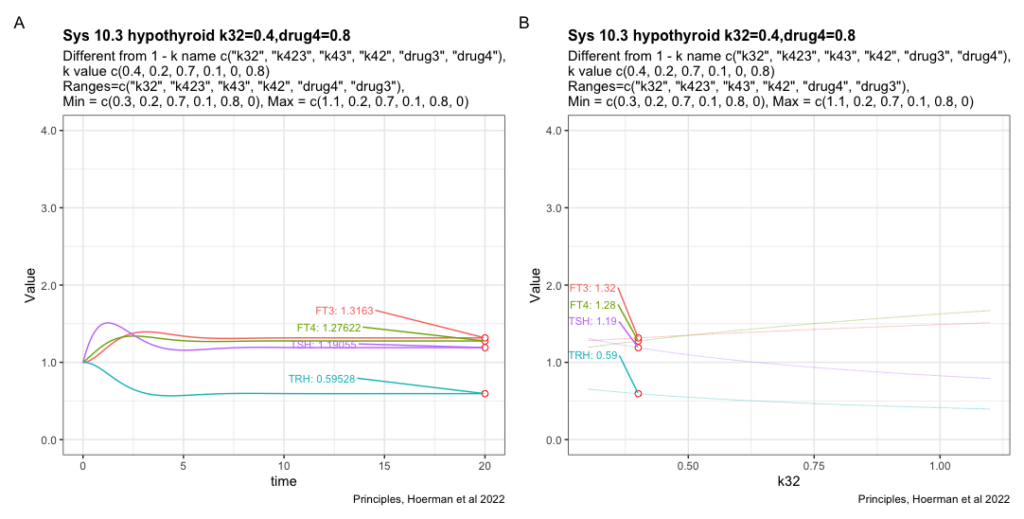
I would like to know how hypothyroid the model can get when the different parameters from fig. 6. A in Principles, Hoermann et al 2022.

Recap text from fig. 6. A: FT4 levels (blue curve) decline, but the mechanisms in system (sys. 10) protect FT3 levels (green curve), keeping them in a range close to the original level, as the percentage of the estimate of FT4 production rate constant (k32 = 0.4 to 1.1) decreases – as typical at the onset of hypothyroidism in patients suffering from autoimmune thyroiditis and progressive thyroid destruction. Other parameters are chosen within ranges, k423 = 0.2-0.3, k43 = 0.7-0.8 and k42 = 0.1-0.2, to approximate the relative contributions to FT3 production according to (32).

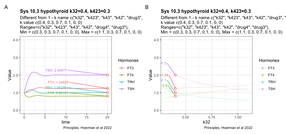
The figures shows the most hypothyroid state the model can achieve under the given conditions.

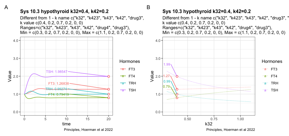
Trying to change the k42 parameter which results in a slight decrease of TSH

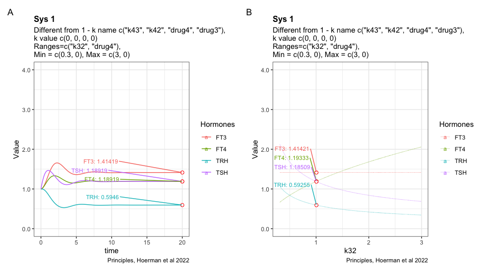
Adding drug4 = 0.8 to the most hypothyroid state. We see FT3 is not returning to the level in the perfect homeostasis. See sys1 below. Apart from that FT3 drops with lower k32.

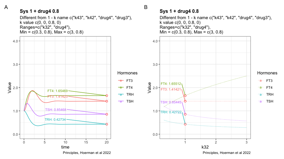
Here I have tried to show the pattern following perfect homeostasis plus drug4. Mimicing the situation where a patient gets unnecessary LT-4 treatment. Will it be possible to identify the pattern and use it to get the patient off LT-4? Is the pattern disguised by the transformation to real hormone values?

Changes

I stumbled over this image the other day – mixing together two images. Yet recreated in R.

Subtracting from the day before – lag – gives this pattern in TSH and TRH when looked at through Simthyr.

For many of the registrations, you see that there is an opposite movement in TRH and TSH. Though there are registrations where this is not the case. What is the reason? I will, later on, dig into the patterns of the other parameters to look for an explanation.

Looking at TT4 and FT4 gives another picture

Subtracting from the day before – lag – gives this pattern in TT4 and FT4 when looked at through Simthyr.

During this time period, it seems as if both total and free T4 is dropping. I will, later on, insert either TSH or TRH to see if there is a pattern to comment on.

TT3 and FT3 have a pattern totally on their own:

Subtracting from the day before – lag – gives this pattern in TT3 and FT3 when looked at through Simthyr.

Subtle spikes of either FT3 or TT3 during one hour – this is interesting and totally different from the other patterns.

As can be seen – the TRH decrease and in this image, we can see the intervals of FT3 spikes shortens. (Update 23-11-2021) If this pattern also exists in vivo it means that it is difficult to capture the T3 changes as the halflife of T3 is short.

This post will be updated with the same data from a hypothyroid simulation – looking into the changes in the thyroid hormones during hypothyroidism. (19-11-2021)

Standard figures hour split into quartiles

1 q minutes2 q minutes3 q minutes4 q minutes
FT3_pmol.l


Max5.62335.62345.62355.6236
Mean5.6232675.6233445.6234335.623533
Min5.62325.62335.62345.6235
SD5E-055.3e-055E-055E-05
FT4_pmol.l


Max18.607718.610918.613718.6159
Mean18.60625618.60951118.612518.614911
Min18.604918.60818.611318.6139
SD0.000950.0010010.0008220.000672
TRHdiv1000


Max7.7204177.084416.2676836.641718
Mean4.6789923.7287013.7700224.005787
Min1.3528530.4511240.9398592.25577
SD1.842022.1545481.4358541.569699
TSH_mU.l


Max2.73152.68412.57692.4747
Mean2.6673112.6309672.4912.4117
Min2.57192.5572.42532.3814
SD0.0554730.0376120.0538880.030551
TT3_nmol.l


Max3.37963.37973.37973.3798
Mean3.37963.3796113.37973.379733
Min3.37963.37963.37973.3797
SD03.3e-0505E-05
TT4_nmol.l


Max128.4115128.434128.4528128.468
Mean128.401744128.424311128.444867128.461456
Min128.3923128.4142128.4363128.4546
SD0.0065330.0067750.0056930.00463

Update (22-11-2021)

Index of individuality and Simthyr

Stig Andersen et al. (1.) 2002 has a table with figures for TSH, TT3, and TT4. With Simthyr I have generated 16 values in intervals of 15 minutes from 8 to 12 o’clock. Of notice is the values for the 16 men and the simulated person from SimThyr the levels in the study are lower than that of the simulated person.

Notice the difference in mean T3 and TSH values between the 16 healthy men (down and up) and the simulated person from SimThyr (STD). The 16 figures from SimThyr are hard to read I have extracted the figures here:

None of these 16 pairs of values are alike. They change slightly over the period of time where most people are having drawn their laboratory tests.

The interactive graph below (opens slowly in a new window) shows the same picture. It is possible easily to identify how different the values are for each individual visualizing the index of individuality. Let the curser hit the dots and view the different patterns.

https://www.glensbo.dk/Files/sa1.html

References:

  1. Stig Andersen, Klaus Michael Pedersen, Niels Henrik Bruun, Peter Laurberg, Narrow Individual Variations in Serum T4 and T3 in Normal Subjects: A Clue to the Understanding of Subclinical Thyroid Disease, The Journal of Clinical Endocrinology & Metabolism, Volume 87, Issue 3, 1 March 2002, Pages 1068–1072, https://doi.org/10.1210/jcem.87.3.8165
  2. Simthyr – or here on these pages